
Tech giant Google has decided to overhaul the visual identity of its Chrome browser, the first change it has initiated in eight years.
The first changes since 2014 are very subtle, and will be visible on both the app and web version of the browser within the next few months.
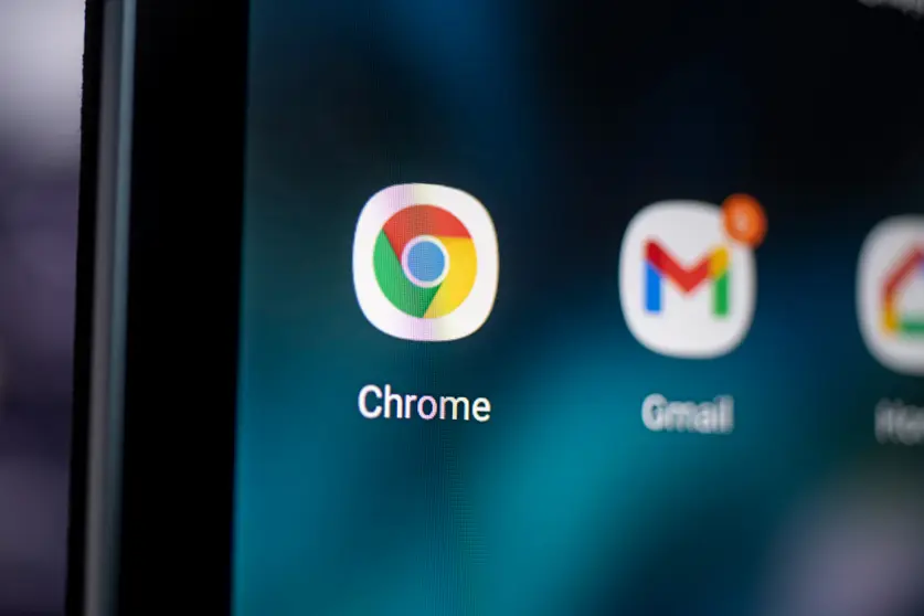
"Some of you might have noticed a new icon in Chrome's Canary update today. Yes! we're refreshing Chrome's brand icons for the first time in 8 years. The new icons will start to appear across your devices soon," tweeted Elvin Hu, a designer for Google Chrome.
Hu said the main brand icon was simplified by removing the shadows, refining the proportions and brightening the colours. This was done to align with Google's more modern brand expression.
Moreover, it was found that placing certain shades of green and red next to each other created an unpleasant colour vibration. So, the company introduced a very subtle gradient to the main icon to mitigate that, making the icon more accessible. The blue circle in the middle of the logo now looks bigger.
Brighter colours
In the tweets, Hu added that the company created OS-specific customizations as icons need to be recognizably Chrome, but also well crafted for each OS.
On ChromeOS, the icons use brighter colours without gradients to match the looks of the rest of system icons. Further, on macOS, they look 3D.
For Beta and Dev, Google applied colourful ribbons to them. Google Chrome's logo, at the time of launch in 2008, was a shiny, three-dimensional emblem. Over the years, it has been changed into a 2D symbol.